Artefact
Record / CD / Tape
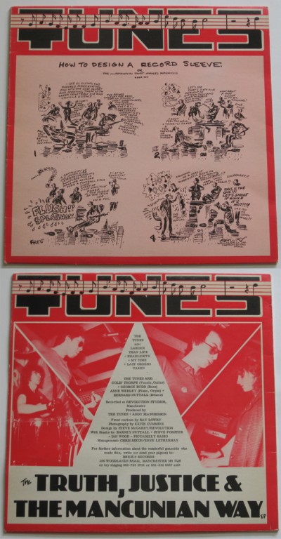
The Tunes
1979
This was a sleeve design I did for The Tunes in 1979. I didn't know the band but I was friends with their manager, Chris Dixon. He was working for CBS Records at this point, and he formed his own label, Rhesus Records, to put this out. The cover was an original cartoon he'd commissioned from the cartoonist Ray Lowry, who was a regular in lots of music publications like NME, as well as private Eye, etc. I seem to recall that the back story was that Lowry didn't really want to be restricted to doing a cartoon and fancied doing some design or art direction for a change ... but Chris insisted on a cartoon, as that was what Lowry was renowned for. Which might explain the tone of the cartoon Lowry came up with. Or not.
Latest Discussion
If you'd like to leave a comment, please
Login