Artefact
Taken from The Drum website:
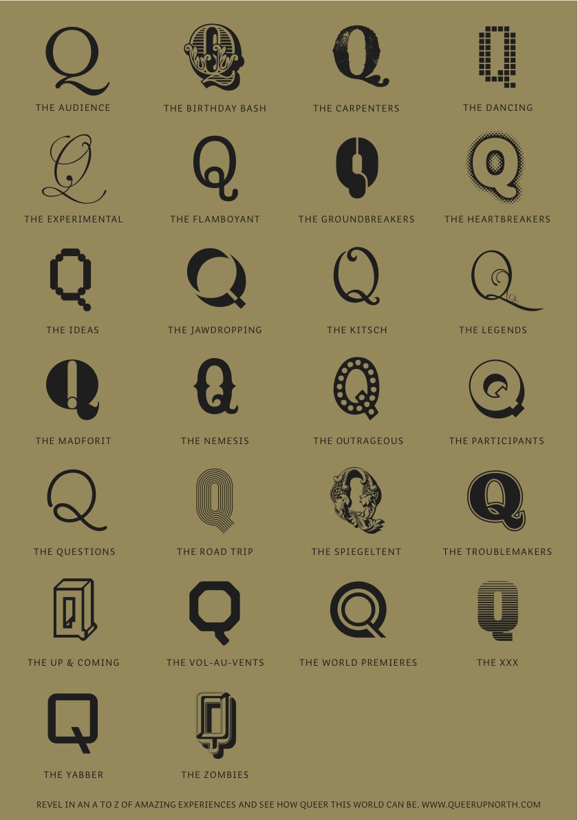
Manchester design agency True North has created a new identity for the Queer Up North arts and culture festival.
The event is now in its 18th year and the brief was to increase awareness among an audience looking for challenging and innovative performance regardless of sexuality.
True North said it wanted to demonstrate "that ‘Queer’ is not just about sexuality but that the festival itself is ‘queer’, i.e. different, unusual, provocative, something out of the ordinary".
Senior designer Matt Maurer said: "The expression ‘Q’ has been adopted as a shorthand for queer, so we felt confident that the gay audience would embrace it and we could also communicate the diversity and quality of the festival to a new audience and avoid any stereotypes based on sexuality.
"To capture the breadth of events and range of experiences, we have developed our own ‘alphabet’ of Qs which will allow us to get loads of personality into the festival’s comms and promotion.”
Latest Discussion
If you'd like to leave a comment, please
Login