Exhibition
Branding of the Hallé: design and identity
2026 has seen the launch of the new Hallé brand and we’ve been inspired to explore our branding history – all 168 years of it. Enjoy exploring our name and identity through the ages here. We look forward to seeing you at our concerts soon!
The Hallé identity
The reason we are called the Hallé is in honour of our founder, Sir Charles Hallé. He was one of the most transformative forces in Manchester’s music history. His vision was that such a great city deserves a great orchestra to serve its citizens and represent its values across the country.
On 30 January 1858 he conducted the first concert of what is now internationally known as the Hallé Orchestra, Manchester. His love of the city and high standard of service to its communities is why we still share his name, as a commitment to these convictions in all we do.
Back to the beginning: 1858-1895 - Hallé’s concerts
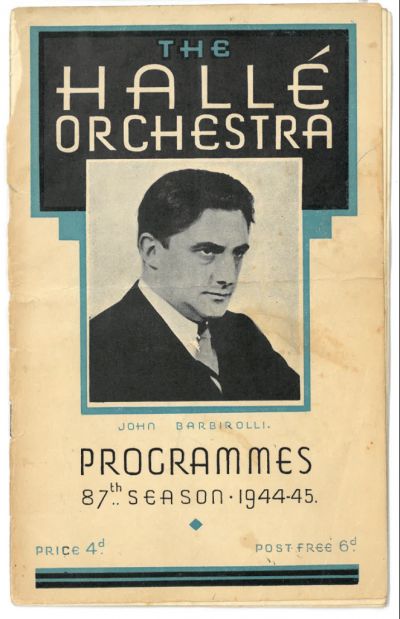
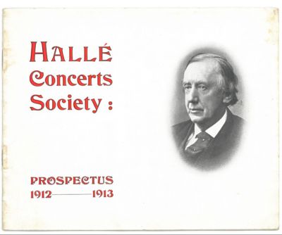
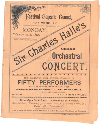
We started as Mr. Charles Hallé’s Band and featured in Mr. Charles Hallé’s Grand Orchestral Concerts. As he was our creator, treasurer, promoter, conductor and manager, we were quite rightly known as Mr. Hallé’s band, or Sir Charles Hallé’s orchestra, until his death in 1895. That was the extent of the consistency however, as Hallé never settled on a brand design. Using as many different fonts and styles as the printing presses allowed, we had no brand aside from the name, Hallé. So long as the Hallé name was printed, the rest was left to the variety of taste.
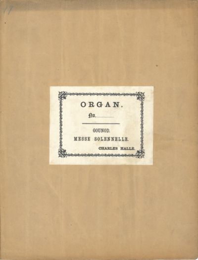
In fact, the earliest print of any consistency is the bookplate from Charles Hallé’s library of music, which the orchestra continues to use, alongside his distinctive signature on the approved manuscript parts.
1895-1899
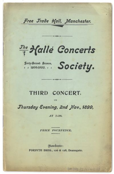
After his death his friends guaranteed their own money to make sure concerts continued for the next few seasons. We were therefore still known as the Hallé Concerts until 1899 when the Hallé Concerts Society was formed to administer and provide strategic direction for the concerts. By that time, even with the world-famous Hans Richter on board as conductor, the decision was made to continue Hallé’s name. And so, ‘the Hallé’ was born.
1899-1958
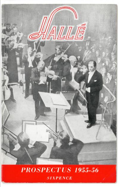
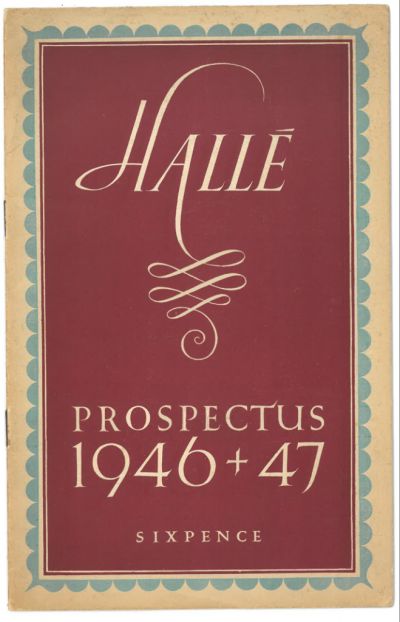
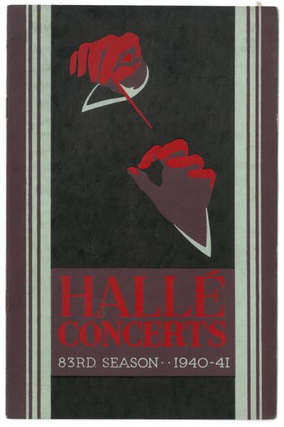
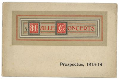
Through the design movements of the Golden Age of Illustration, Art Nouveau and Art Deco, we experimented with design in a way of keeping up with changing tastes. Indeed, there was no noticeable consistency in our brand until 1946 when the swooping lines of the H of Hallé made its first appearance in print. This became a regular motif, almost becoming the brand itself in some instances, until we finally seemed to settle on a standardised logo for the very first time during our centenary year in 1958. It is likely that this was born of necessity with over 160 concert engagements requiring a visual anchor back to the Society and its celebrations.
1958-2002
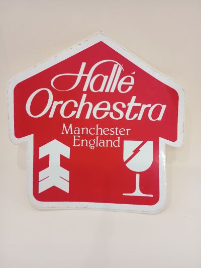
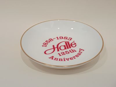
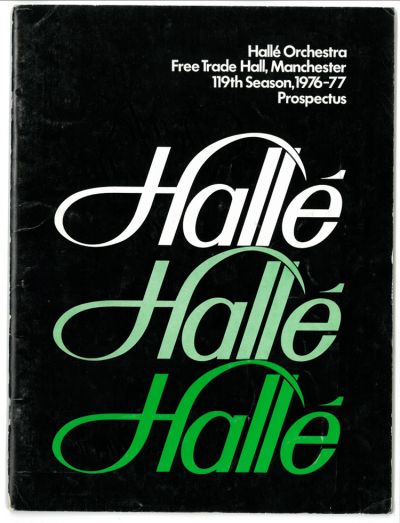
Leaning fully into the Hallé brand, we spent the next 45 years deviating very little from the established identity. We toyed with sub-brands for different series, especially for proms, youth and schools’ concerts. In 1976 we dropped the all-caps style and made more of the swoop and arc of the H once again. We toyed with the name set on staves for our 125th anniversary and briefly presented a cursive style in 1988 before returning to form the following season.
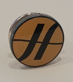
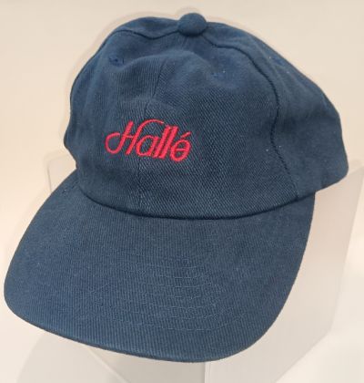
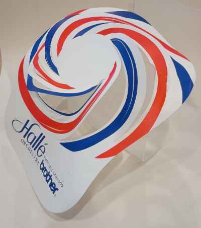
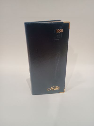
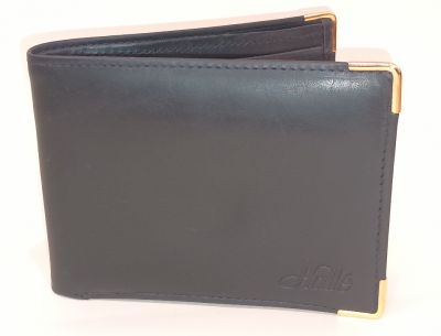
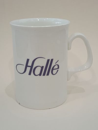
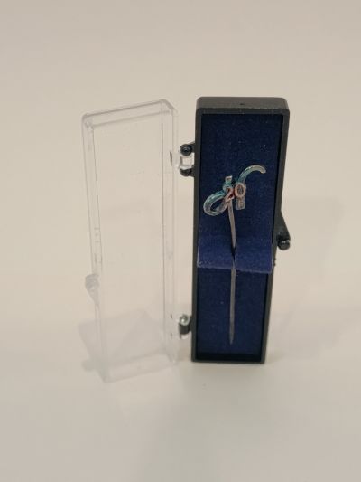
This period also saw the emergence of merchandise. From lapel pins, mugs, caps, pens, shirts and more, if it could be printed or embroidered then we wanted our name on it.
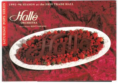
In the 1990s, the capacity to digitally manipulate designs expanded dramatically. In 1992, Adobe Photoshop was widely available for the first time and in 1994 it released an even more powerful manipulation tool. This may be the reason that our programme designs and logo in 1995 went rather... extra.
2002-2026
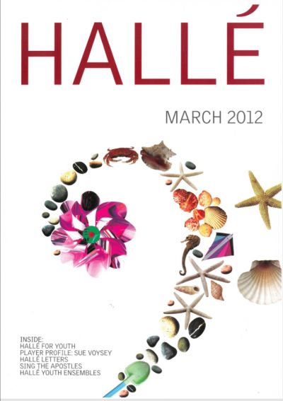
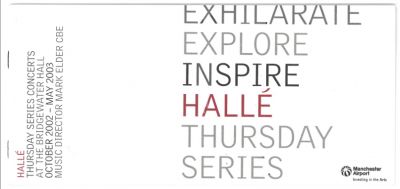
Reminiscent of our need for connectivity in identity from 1958, it was the 2002/3 season that saw the emergence of our Hallé house style with our own font, colour palate and purpose. The rebrand was not just a logo change but was part of an honest reflection on our identity, with a substantial investment of £3.8m from Arts Council England’s Stabilisation Fund to help us overcome a financial crisis.
How we dressed on stage, how we connected with our existing and emerging audiences and even how we talked about ourselves were all critiqued and revised. Similarly, the creation of the Hallé Youth Orchestra and Hallé Youth Choir required a visual and easily recognisable method for identifying all Hallé Concerts Society activities as equal branches of one established family.
The clean and crisp design became the modern Hallé brand.
2026-
The new identity honours our long-standing legacy whilst looking confidently to the future. It reflects how the orchestra and our audiences have evolved, and supports our ongoing work to welcome more people to share music with us. Working in close collaboration with creative agency EDIT Brand Studio and audience research specialists Indigo, we consulted staff, players and audiences to understand how the brand could better profile our work and continue to welcome new and returning audiences – across Greater Manchester and beyond.
At the heart of our brand identity is a reimagined version of the Hallé’s iconic ‘H’ developed by lettering artist Dan Forster – a sweeping lettering first introduced in the 1960s, now reworked as a graphic device that interacts with type and images. The modern colour palette was inspired by the city surrounding us, with hues drawn from Manchester’s eclectic cityscape.
Fresh photography was commissioned from photographer Drew Forsyth showcasing the music and musicians of the orchestra in new and creative ways, whilst remaining authentic and honest – locating them in spaces that have connection to the Hallé.
Proud to keep Charles Hallé’s name and ethos at the forefront of our identity, we continue to take the Hallé name and Mancunian pride around the world.
 Donate
 Upload