“This was done entirely by Rob Gretton and me - I don't recall that Rabid was involved too much (although they may have helped out on the printing and maybe chipped in by buying an ad for the single?)
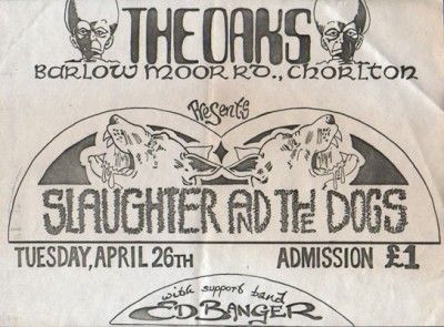
Rob and I had been mates since school and still spent a lot of time together. He was running Slaughter's fan club at the time and generally helping out on the PR side, as well as promoting shows at The Oaks in Chorlton. I used to do all his art. It was Rob that got me to do the original Slaughter logo (the alsatian) and that was used on badges and stickers.
He wanted to do a fanzine so he came to me with the copy and the photos and I put it all together. I was working in the studio at Great Universal Stores at the time ( I went freelance in July of 1977 so that was the last proper job I ever had) and I used the office typewriter, nicked a bit of Letraset and then handwrote all the rest. The art on the Stan The Man page was nicked from a Conan The Barbarian comic that was lying around the studio. I could pretend that I was an innovative genius who was foreshadowing the goth movement but the honest truth is that I needed some sort of graphic to fill a hole on the page and the Conan comic was the first thing I put my hand on. No clue as to why we thought it was a good idea for me to draw the doghouse but it must have seemed like a clever notion at the time ... ah, the follies of youth.
It was Rob’s idea to call it “Manchester Rains” which was a fact and a play on words … rains/reigns … geddit? He went on to call his first record label Rainy City Records.
Looking at the credits, other than the fact that I misspelled Cummins on the photo credit, it looks like we thanked:
Leslie: Rob’s partner
Ray: That would be Slaughter manager Ray Rossi (Mick Rossi’s brother)
Slim: Not sure who that is
Vini: That was Vini Faal, flyposterer and manager of The Nosebleeds
Uncle Tosh: That’s Tosh Ryan, owner of the flyposting business and the guy who launched Rabid Records
Adge ’n’ Birko: That was my brother Adge and Steve Birkhead, who both worked at GUS and must have helped with camera prints and paste-up, etc. (No computers in those days!)
When the Fanzine came out it was reviewed by a couple of music papers. Julie Burchill reviewed in in the NME and slagged it off, saying it was “too professional” and “slick” - which was funny because it was just my scribbled handwriting and a bit of text done on an old typewriter. Proper DIY punk!”
“Wow - I'd forgotten all about these until I just saw this post. Rob Gretton had me design these back in the late 1970s. He wanted a quick series of different designs so I just used whatever sheets of Letraset I had on hand.”
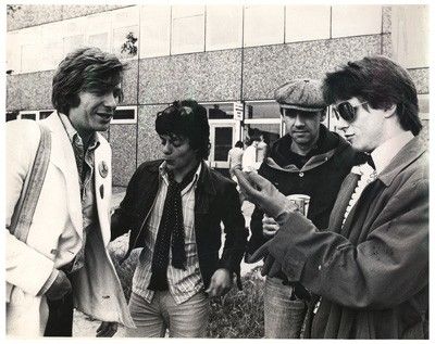
“I think this was probably when Slaughter signed to Decca. Mike's brother, Ray, managed the band, and he came up with a publicity wheeze - which is why Tony was there. Suitably inspired by the Sex Pistols signing their record contract outside the gates of Buckingham Palace, he decided that Slaughter would make a grand symbolic gesture and sign to Decca outside the dole office. I don't think he had an actual contract on the day, so I vaguely recall that they signed his gas bill or a summons, or something like that. It was more likely 1977 or even 1978, I think?”
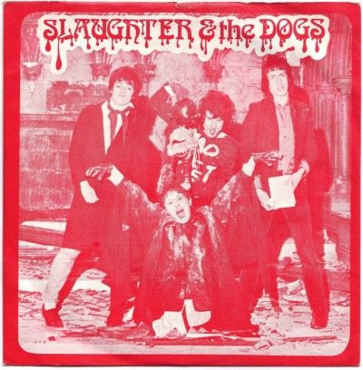
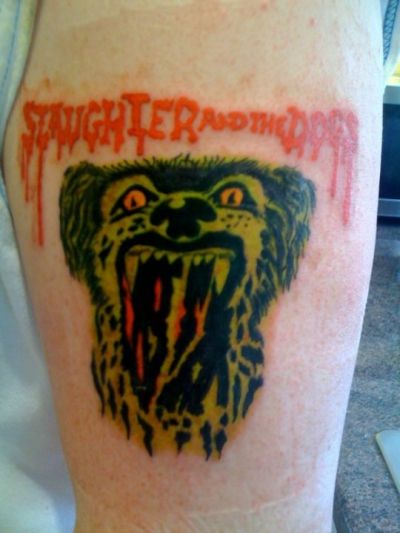
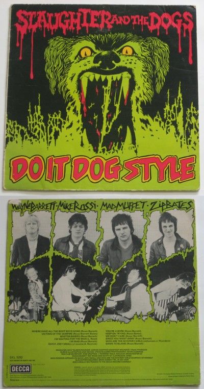
“This was the first record sleeve that I designed for Rabid Records. I still see that lettering used on Slaughter product today ... and the reverse side of the sleeve featured the original dog's head logo that I designed for them. I remember meeting people who had that logo tattooed on their arm, which was quite startling. When Slaughter signed to Decca, I did the album sleeve for Do It Dog Style. I ended up doing most of the Rabid sleeves ... Jilted John, Tim Green, Ed Banger and all that good stuff. Rabid's HQ was on Cotton Lane in Withington, and that's where label head Tosh Ryan also ran all the flyposting from. Whenever you went in there, there would always be a bunch interesting people, whether it was Martin Hannett (who did most of the Rabid production) or lads from other bands. I went in Stiff's offices in London a couple of times and it was the same vibe. Downstairs it was Stiff, so there'd be the likes of Ian Dury wandering in ... and upstairs were the offices for Jenner and King, who managed Pink Floyd (and, at one point, The Clash.) Both places seemed like constant hives of cool activity, although it was probably just me being easily impressed.”
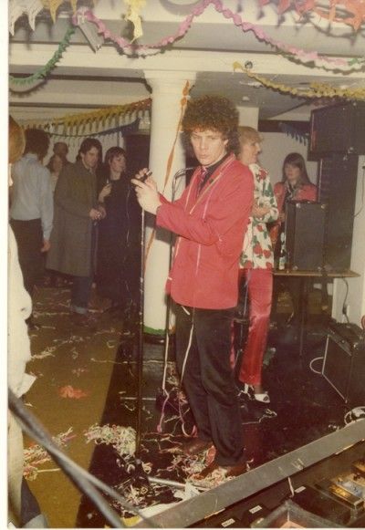
“Dave is right. The Oaks was opposite the cemetery, so everyone from Wythenshawe would come up and get off the bus at the corner of Princess Parkway and Barlow Moor Road. Vini Faal and Rob Gretton started the promotion there ... before that it was strictly a cabaret lounge. I remember seeing Foo Foo Lamarr play there once! Rob and Vini started a new wave night in early 1977. Johnny Thunders played there, Siouxsie played. (I remember doing a flyer for The Jam but I don't think they played the promotion, so they must have bailed.) Vini began promoting there on his own after a few weeks. Sad Cafe played there and I believe that's where Paul Young got the idea of doing some promoting himself, so he teamed up with Dougie James (of Dougie James and The Soul Train) and they started promoting at Rafters, although it very quickly ended up as Dougie's promotion. Dougie brought in everyone, from Elvis Costello to Dire Straits, from Sham 69 to XTC. There was also a heavy metal night where they'd get in bands like Whitesnake and Motorhead. Rob Gretton was Dougie's deejay and that's where he got to know the lads in Warsaw, who soon became Joy Division.”
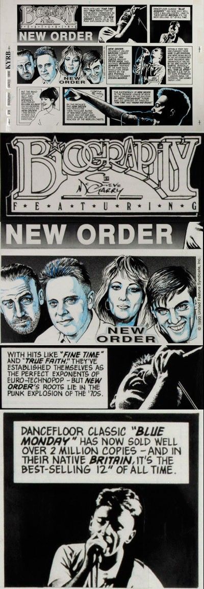
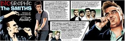
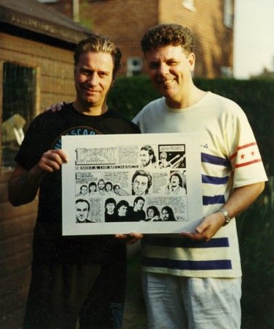
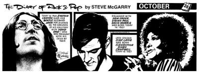
“This is from 1990. I'd been living in California for a year and BIOGRAPHIC was a Sunday strip that was syndicated to newspapers throughout the U.S. by United Media (the same people who syndicate Peanuts, Dilbert, etc.) The McGarrys spent a month back in the UK during the World Cup (I watched all the games in my mate Pete Morrall's pub in Cheadle) and I brought the original artwork back to Manchester with me to give to Rob Gretton.
Rob drove me over to Johnny Marr's house in Bowdon to meet Johnny and Barney (they were recording the Electronic stuff there) and get some pics of me presenting the original to Barney, which we were then going to use as promo back in the States. Unfortunately, we had to borrow some guy's camera and I never saw the final pics!
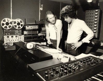
The art was india ink on Bristol board, and the blue pencil marks were there to guide the colorists who added the colour for the Sunday "funny pages." Since the advent of personal computers, most artists colour up their own stuff in Photoshop now. Funnily enoough, most of the conversation that night centred around how ubiquitous New Order and Depeche Mode were in Southern California in 1990 - they still are, btw – and comparing notes on the new-fangled Apple Macs that Electronic were using to record, and I had just started to use in creating black and white art (they weren't really capable of creating colour cartoon art at that time.)”
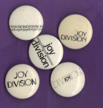
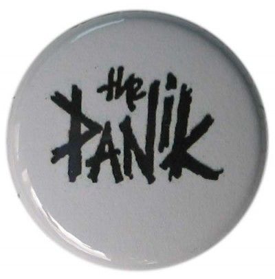
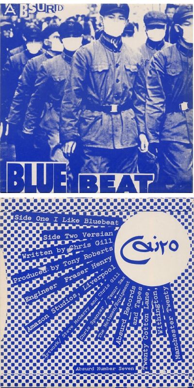
“I knocked out the logo for this ... that's my customary scrawl, which we used on everything from Joy Division to Slaughter & The Dogs. I designed the sleeve for "It Won't Sell" by The Panik. I don't have a copy of the sleeve anymore but it's an interesting one if anyone has a copy to upload. The main picture is a photograph of rentboys hustling on a New York street in the 1960s, but looking at the hairstyles and fashions they were sporting, you'd have sworn that it was a UK punk band from the late 1970s. Rob Gretton found the photo in a magazine and we just appropriated it for the sleeve.”
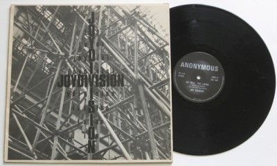
“I don't honestly know. I remember that he definitely already had the scaffolding idea in mind, and that we scouted the Fountain Street location together to discuss what the finished thing would look like. He wasn't with me for the photoshoot, so we must have agreed beforehand exactly how it would look. The type on the front was Letraset ( I describe what that is on the posting about The Tunes EP sleeve) and the back text was handwritten on a sheet of transparent Mylar overlay over the artwork. The idea was that Rob could then see how the finished sleeve would look, and he had the choice of going with the handwritten version or waiting another couple of days and paying to have the type set professionally at a typesetters. It was quicker, cheaper and easier to just go with the handwritten text, I think.”
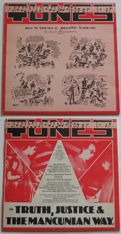
“There's probably a number of factors at play. We were all working with very limited (or nonexistent) budgets for starters, and this was long before the dawn of apple macs and desktop publishing. A lot of the type was handwritten or knocked out on an electric typewriter, because; a) we were punk/new wave, maaaaannn! ... but mainly b) the unsigned bands just didn't have the cash to have the type created at a typesetting house. (In those days, type design was all educated guesswork, which involved choosing a font and size from whatever fonts the type house stocked, and then doing a "spec". The type would come back on two galley sheets, one of which was then pasted onto the artboard with Cow gum or Spraymount to create camera-ready art ... unless it was wrong, in which case you either got creative with a scalpel or sent it back to have it reset.) I had a limited library of Letraset sheets, which was type that you applied like a kids' rub-on temporary transfer tattoo, and this is what was used for headers, logos, etc., and occasionally for body copy. No doubt that will be why the Nosebleeds and Tunes type is similar ... I probably only had a reserve of 30 or 40 Letraset typefaces to choose from without running up the band's bill by having to buy more.
As to palette - unless it was for a major, the bands could usually only afford a one-color sleeve. The Tunes evidently went for a two-color sleeve here ... and I've always thought you can't go really go wrong with red, black and white for rock - just look at how well it worked for The White Stripes all those years later.
Looking back, it was all very amateurish and primitive - but that was the fun of it, I think.”
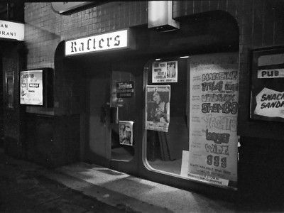
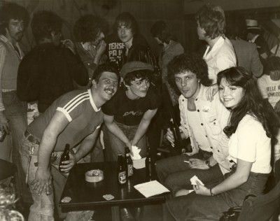
“I used to produce all the inhouse promo posters for Rafters - that's one of mine in the window there. I would buy a huge roll of yellow dayglo paper and do these giant posters, probably three to five feet in length. The lettering was all hand drawn in black with various shades of red and green, in a kind of graffiti style.
Dougie James was the promoter, and each week he'd give me a list of names of the upcoming bands and I'd do a separate poster for each one.
Rob Gretton was the house deejay, so he was working there and I'd be hanging out two or three times a week. That's where Rob first saw Warsaw, if I recall correctly, before the name change to Joy Division.
The Sham 69 gig that was advertised in the window was one where it all kicked off, I remember. A band of skins steamed into the club during the set and there was pint pots and bottles flying all over the place. Pretty ugly.
I can remember wandering upstairs many times into Fagins. Dougie James and the Soul Train played there a lot - I can recall seeing Tony Wilson get up on stage with Dougie one night - and you'd find Ray Teret or Sad Cafe in there having a drink.”

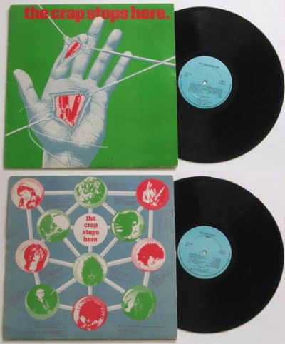
Rob and I had been mates since school and still spent a lot of time together. He was running Slaughter's fan club at the time and generally helping out on the PR side, as well as promoting shows at The Oaks in Chorlton. I used to do all his art. It was Rob that got me to do the original Slaughter logo (the alsatian) and that was used on badges and stickers.
He wanted to do a fanzine so he came to me with the copy and the photos and I put it all together. I was working in the studio at Great Universal Stores at the time ( I went freelance in July of 1977 so that was the last proper job I ever had) and I used the office typewriter, nicked a bit of Letraset and then handwrote all the rest. The art on the Stan The Man page was nicked from a Conan The Barbarian comic that was lying around the studio. I could pretend that I was an innovative genius who was foreshadowing the goth movement but the honest truth is that I needed some sort of graphic to fill a hole on the page and the Conan comic was the first thing I put my hand on. No clue as to why we thought it was a good idea for me to draw the doghouse but it must have seemed like a clever notion at the time ... ah, the follies of youth.
It was Rob’s idea to call it “Manchester Rains” which was a fact and a play on words … rains/reigns … geddit? He went on to call his first record label Rainy City Records.
Looking at the credits, other than the fact that I misspelled Cummins on the photo credit, it looks like we thanked:
Leslie: Rob’s partner
Ray: That would be Slaughter manager Ray Rossi (Mick Rossi’s brother)
Slim: Not sure who that is
Vini: That was Vini Faal, flyposterer and manager of The Nosebleeds
Uncle Tosh: That’s Tosh Ryan, owner of the flyposting business and the guy who launched Rabid Records
Adge ’n’ Birko: That was my brother Adge and Steve Birkhead, who both worked at GUS and must have helped with camera prints and paste-up, etc. (No computers in those days!)
When the Fanzine came out it was reviewed by a couple of music papers. Julie Burchill reviewed in in the NME and slagged it off, saying it was “too professional” and “slick” - which was funny because it was just my scribbled handwriting and a bit of text done on an old typewriter. Proper DIY punk!”